Stills or a storyboard barely changes character identity, the real difference is cut count
If you’re making an ad film around a product mascot, the first decision is what to anchor the character on. We ran two approaches across seven products, same scenario, same 40 seconds, and measured them. Identity barely diverged. What diverged was cut count. We also found out, later than we should have, that a third method we’d already given up on had been dead the whole time because of a single parameter.
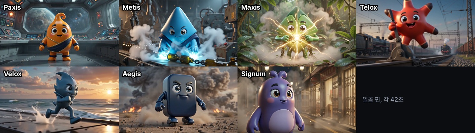 One film per product, each 42 seconds. Which method built which one varies by product.
 A visual metaphor for the article’s key idea.
Two methods
Both methods start from the same place: four 1024x1024 character stills made with an image model.
The first feeds those stills straight into the video model as conditioning. The character is described in prose in the prompt, and the stills anchor the look. The second draws a 3x3 cinematic storyboard sheet from the stills first, then conditions on that sheet instead. Each of the nine panels carries a handwritten timecode and camera direction, so composition travels along with the look, not just appearance.
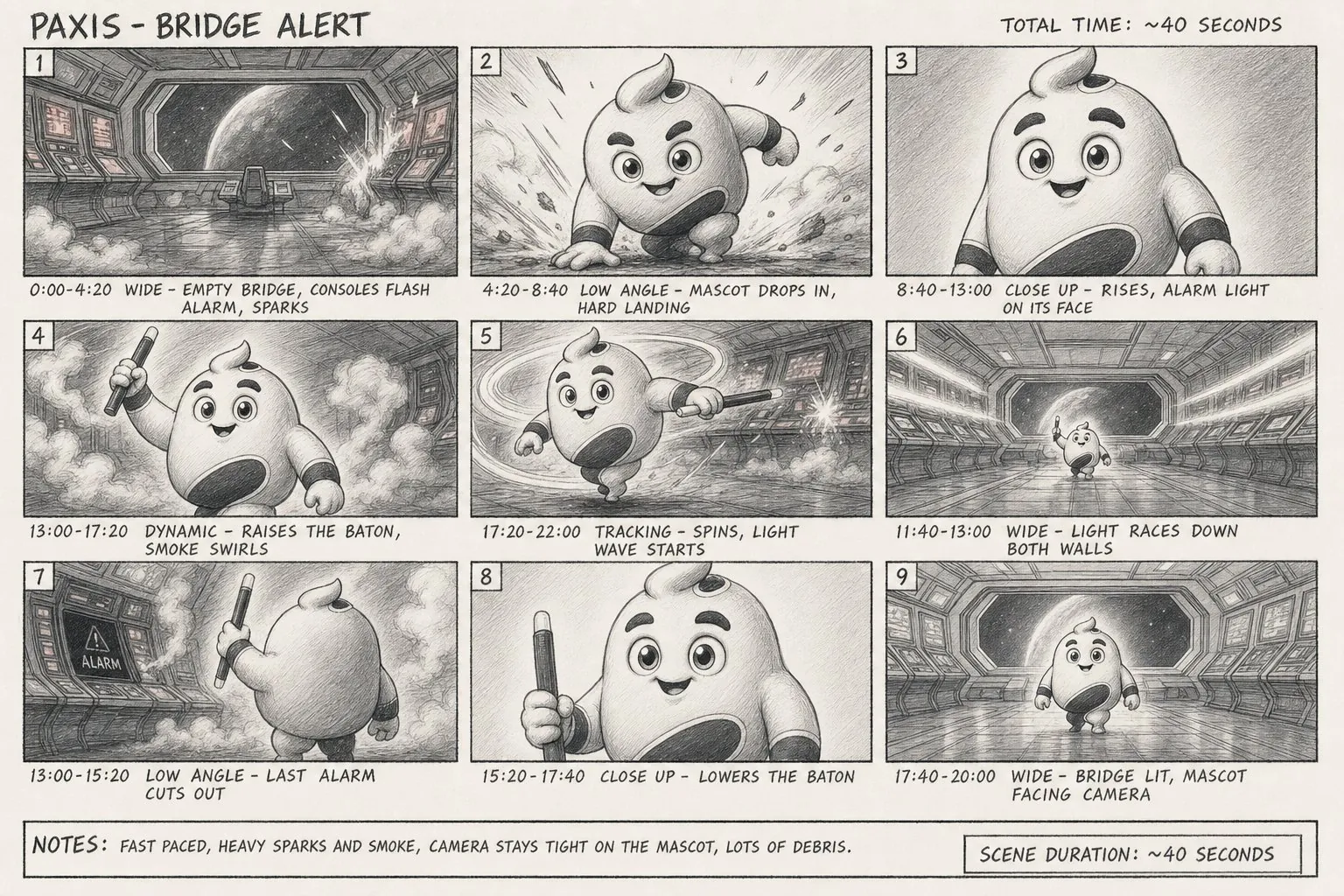 A nine-panel sheet. Each panel has a timecode and camera direction written under it.
We made all seven products both ways. Scenario, length, seed, and resolution were fixed, so the only thing that varied was the conditioning method.
Identity diverges less than we expected
Average CLIP-I against the reference stills came out at 0.636 for the stills method and 0.617 for the storyboard method, a gap of 0.019. Stills led in five of the seven, storyboard led in two.
Sample size decides how large this gap appears. Measured on two products alone the gap reads 0.047 and 0.049, and by eye the storyboard-conditioned version looks clearly different. Across all seven the average gap falls to less than half of that, and on two products the sign flips. The direction holds, but a size estimate drawn from two products overstates it by more than double.
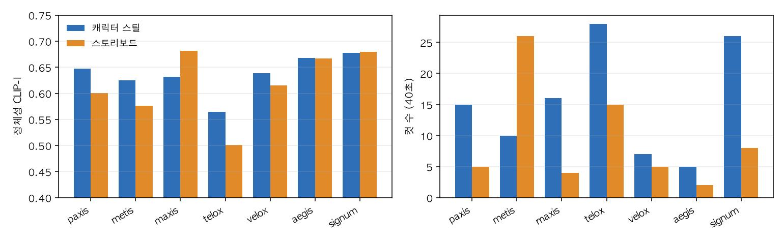 Identity on the left, cut count within the 40 seconds on the right. The left pair sits close together, the right pair spreads apart.
What actually diverges is cut count
Within the same 40 seconds, median cut count was 15 for the stills method and 5 for the storyboard method. Stills cut more often in six of the seven. The remaining one went the other way and by a wide margin: storyboard hit 26 cuts against 10 for stills.
The reason follows naturally from what the sheet does. Because the sheet fixes composition, the model changes the scene less, and the result reads calmly. Feed only stills, and the model reframes at every moment, mixing close-ups and wide shots into something that reads more like a film. Which one is right isn’t a matter of taste, it’s a matter of purpose. Use the sheet to show a product calmly, use stills to hold attention.
The sheet carries more than composition
One thing stood out outside the numbers. Our mascot has a rounded teardrop shape, and the storyboard-conditioned version came out with a body that was more pointed and elongated. One character even had its navy waist band turn into a diagonal sash draped from the shoulder.
That’s because the sheet was drawn as a pencil sketch. Sketching simplifies form and shifts proportions slightly, and those proportions carry through into the video. A device introduced to control composition ended up carrying the silhouette along with it. If you’re going to use a sheet, it’s safer to keep the sketch style close to the original render.
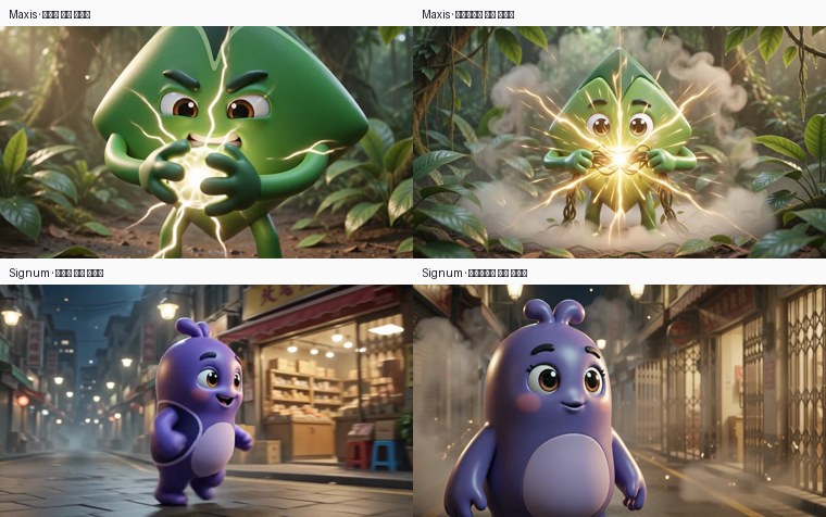 Same product, same moment. Stills conditioning on the left, storyboard conditioning on the right.
A default value fooled us twice
The first ads we generated were visibly blurry, and the cause wasn’t the conditioning method. Generation resolution had been sitting at 832x480. That was the script’s default and nobody had raised it. Switching to 1280x720 pushed bitrate from 0.41 Mbps to 3.0 Mbps in the same pipeline.
On top of that, we were cutting quality a second time. Re-encoding was stacked three times: once when trimming cuts, once when concatenating, once when compressing for delivery. The fix is to keep intermediate stages near-lossless and compress only once, at the end.
The second default cost us more. We had a third method: make a separate video of the character moving and feed that in as a motion instruction. We tried it three times, and all three times the result came out looking like a flat cartoon. The source background showed through, and the eyes on the face got mushy. We wrote it down as an axis this stack couldn’t do.
That judgment was wrong. The pipeline has a value that sets the strength of the motion instruction, and we hadn’t touched it in any of the three tries. The default sat at maximum, and at maximum the model blacks out everything outside the instructed region. What we’d read as the source background leaking through was actually a frame where the world had been erased, leaving only the instructed region.
 Same instruction, same prompt. Only the strength changed, across 0.3, 0.6, and 1.0.
Sweeping strength across three levels made the answer obvious at a glance. At 0.3 the model builds a beautiful greenhouse but ignores the instruction and the character just stands there. At 1.0 it follows the instruction exactly but the world disappears. 0.6 does both at once: the greenhouse aisle recedes into perspective, pots and plants stand in it, and inside that world the character crouches, rises, and lands. Identity score was also the highest of the three levels, at 0.704.
The source we fed in as the motion instruction was a single plain gray cutout, made by scaling and stretching one character still with Python. The model built the entire world on its own.
Whether it’s picture quality or output quality, when you hit a problem, count the defaults before you doubt the model. We fell into the same trap twice, and the second time nearly cost us an entire axis we’d otherwise have given up on.
What we chose to ship
To actually ship seven films, we had to pick one method per product. To avoid picking by taste, we set a rule first: fewer cuts wins, unless identity gaps by more than 0.05, in which case that flips the decision. Cut count is the axis that actually diverges and identity is the axis that doesn’t, so it makes sense to put a high threshold on the axis that doesn’t diverge.
Running the rule sent five products to storyboard and two to stills. The reasons for the two that stayed with stills are clear. One was the outlier where storyboard cuts spiked to 26, the other crossed the threshold with an identity gap of 0.063.
All seven finals are 1280x720 at 42 seconds. There’s exactly one final re-encode, and the product card at the end is rendered at the same resolution as the video. Card text has its width measured and then checked against the safe area. We’d previously calculated a width and never checked it, which drew 877-pixel text on an 832-pixel canvas once. Code that calculates a width has to carry the check for that width too.
Do you need training
None of the three methods here involve per-character training. Four stills, one sheet, or one cutout video is all it takes. Even the sound is generated by the model.
We also have results from training an adapter on the same character. 400 steps of training got an identity score of 0.560. The motion-instruction method with no training at all scored 0.704 on the same character, same evaluator, same reference. That said, the prompt sets differ, so this isn’t a controlled comparison. We’re only saying it’s the most comparable number we currently have on hand.
Still, the direction looks clear. Large video models already know how things move. Rather than retraining that knowledge, instructing only what to draw was cheaper and worked well.
Limits
CLIP-I, the identity metric we used, looks at the embedding of the whole frame, so scores rise when backgrounds are similar. Even when a character’s form breaks down, the score doesn’t drop much if the colors and silhouette remain. Background conditions were the same across both methods in this comparison, so it’s usable as a relative comparison, but these numbers should not be read as absolute quality.
Here’s one more time a metric fooled us. In the strength sweep we tried measuring the character’s vertical position frame by frame to check whether it tracked the jump, and the 0.6 setting came out looking almost motionless. The cause was that the method picks the background by the most common brightness, which grabbed the greenhouse plants as the subject instead of the character. We only caught it by laying the frames out and looking. When an automatic metric disagrees with your eyes, it’s usually measuring something else.
The numbers here are measured from seventeen films actually generated on our own GPUs.
References
- DreamBooth: Fine Tuning Text-to-Image Diffusion Models for Subject-Driven Generation: the paper that first defined CLIP-I, the identity metric used in this post, as an evaluation protocol. It measures subject preservation as cosine similarity between the CLIP embeddings of a generated image and a reference image.
- Learning Transferable Visual Models From Natural Language Supervision: the original CLIP paper, whose image embeddings are what the CLIP-I calculation uses.